Orange-Teal The Movie
coming soon: Orange Teal – The Movie
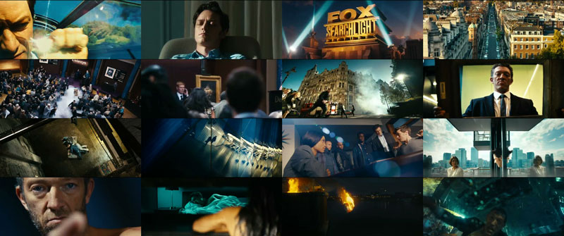
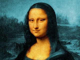
Just kidding, it’s a trailer for “Trance”. A movie about stealing a painting. Probably that painting:
Skyfall
I’ve caught up on the latest installment of the Bond franchise – Skyfall.
Short verdict: If you love formulaic Bond movies, this one’s not for you. If you are sick of orange-teal color grading, skip it as well. Skyfall fits well into our times, where it’s enough for a blockbuster action movie to be filmed well so it can get tagged as “gritty” by the marketing department. It has references to the Bond franchise here and there but overall the plot is ludicrous and far from original (chase across the roofs of Istanbul like in The International and Taken 2? Check.). But at least the movie really is well-made in terms of cinematography and stunts.
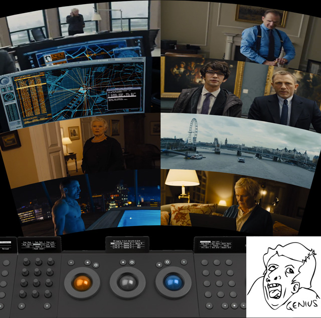
orange/teal right down to the interior design and user interfaces
The movie has a particularly nice last act. No far-fetched showdown on a space station or a sinking building in Venice (although some might say that this is what made Bond movies Bond movies). It was slow-paced, it had nice cinematography and a refreshing lack of in-your-face CGI and gadgets.
On the other hand, most of the movie belongs into the fantasy genre. It starts right off with Bond surviving a 100 meter fall from a bridge and goes on with the numerous depictions of 90’s style computer hacking. You know, giant screens with lots of motion graphics and random numbers on it, technobabble and computers popping up animated “ha ha you’ve been hacked” messages. Computers are used as a lazy plot device that can do anything whenever the scriptwriters require it to. In other words: it’s magic, which makes me think of Skyfall as a high tech Harry Potter movie.
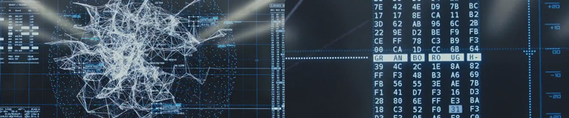
Oh no! An encryption algorithm that only 6 people in the world know about! Let’s just look for the letters that are not hex numbers and we’ve got the key.
6/10 (the “at least it wasn’t THAT bad” level)
Comp-Fu Answers Part 1
Welcome to my new show where I answer questions that are based on google searches that brought users to my website. (disclaimer: I’m using piwik for web site statistics and search keywords are transmitted by the user’s browser. It’s anonymous though, so relax.)
what is color space and color temperature
— anonymous
Thanks for your question, Mr Anonymous. Color Space and Color Temperature can be looked up on Wikipedia. In VFX specifically, the term color space usually means the way that a color is being split into separate channels for digital processing. RGB by default (red, green and blue channels). It can be converted back and forth to spaces like HLS, Lab, YUV and so on where you still have red, green and blue channels but now each channel contains a different color attribute. In HLS, the red channel contains a color’s hue, for example.
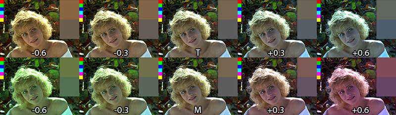
Color temperature is a measure for how cool or warm an image appears (top row of the image). It has a well-defined physical background but basically it’s your white balance setting. It can be adjusted in most RAW converters and although it’s not a color space you can adjust it using the TMI system which includes a magenta-green-value in addition to the orange-blue color temperature axis. It’s available in Shake and Nuke and I’ve made a macro that brings it to Fusion.
color temperature in Nuke
— anonymous
I think there’s no color temperature node in Nuke, but I adjust the temperature of an image using a Gain adjustment:
Open the gain color wheel and enable the TMI sliders if they’re not yet visible. Then, adjust the T slider to your liking. The image might appear brighter or darker now so as a second step, I use the V slider of the HSV group and bring it back to 1.0. This makes sure that the image stays as bright as before (that’s not totally true, but it’s a good rule of thumb. Of course you can tweak every slider to your liking).
I choose the ColorCorrector instead of Grade or Multiply because it has a saturation slider that is applied before the gain and can be used to make the warm or cold tint of an image stronger (if you desaturate the image completely before tinting you’re doing what Photoshop’s Hue/Saturation adjustment calls colorizing the image).
game of thrones color grading
— anonymous
That’s funny. I’m no authority but a while ago I made a blog post on that topic. And coincidentally it involves color temperature 🙂
Colorful
This is nerdy.  The RGB Colorspace Atlas by Tauba Auerbach is an RGB color cube in a handy 20cm x 20cm x 20cm book.
But what gamut is it in? 🙂
The exhibition’s page at MOMA claims that “Each volume contains the entire visible spectrum” which is probably hogwash. But it’s a cute project anyways.
Orange Teal Contrast
 I’ve read an entertaining rant about the apparent overuse of the orange-teal (warm-cold) contrast in contemporary movies. And once your attention has been called to it it’s really kinda impossible not to notice it wherever you look (here’s an overview of movie posters using that particular look).
 And here are some screen-shots of what is currently my favorite TV show: Game of Thrones. Color temperature serves a clear purpose here. Not only does it give each of the multiple subplots a distinct look, it also serves as a compass as to where on the map the plot is located. Sometimes, however, the orange faces are overdone and make the actors look like Oompa-Loompas. That’s mostly the case in the North where there’s no “natural” orange tones.
Natural, of course, meaning “put there by the props and costumes crew”. Kings Landing, for example, is bathed in orange light but there are still blue hues in the picture (sky, garments and carefully placed specular highlights). In the North, the only natural warm tones are candles so the faces sometimes seem to have been graded towards orange a little bit too eagerly.
Once you pay attention to light and colors in Game of Thrones, you quickly notice what an awesome job the people involved have been doing. A lot of the show’s high production value stems from the fact that the images look gorgeous throughout each episode. Interior scenes are made to look like they are lit by natural light only which bathes most of the rooms in darkness and helps sell a realistic medieval setting. Color and light also promote specific attributes like poverty/toughness or wealth/decadence: southern cities, it seems, have been blessed by an abundance of sunlight which pushed culture, arts and architecture forward while the northerners seem to fight against mother nature’s cold shoulder each day of their life.
You just can’t imagine portraying the north as a magic-hour landscape while the south is lit by a harsh blue light. Here are some more screengrabs of contrasty, low-key interior scenes:

TMI Color Temperature Correction
 One of the things that I miss in Fusion whenever I have been using Nuke is a way to adjust colors using color temperature. Yes, there’s a white balance tool, but it’s a bit of a black box and it doesn’t have the kind of sliders known from Nuke (or even Photoshop’s RAW converter). I think Fusion’s tool is pretty accurate in terms of color science, but for eyeballing adjustments or creative tinting the other programs’ sliders are more useful.
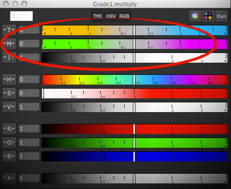
Nuke provides the TMI system in its color picker so you can use it anywhere you see a color swatch. One parameter adjusts the color temperature by moving red and blue in different directions (you don’t have to specify a proper temperature like 5300K). The second parameter is a shift along the magenta/green axis.
Here’s a macro which allows you to tint an image using this system in Fusion. I don’t know if the formulas I’ve reverse-engineered are only used in Nuke or if there’s a standard for TMI (it’s kinda hard to find information about it). It goes without saying though that all of this is only valid in a linear color space. Reportedly it was also useful to cancel the effect of the ARRI Alexa’s white balance and CC Shift settings.
update August 2013:
I’m getting a bunch of Google hits for the TMI system, although I haven’t spelled out the formulas I’ve used for my macro. Here they are (as used by Nuke’s color picker)…
Color Temperature (T):
Red Gain = 1 – T/2, Blue Gain = 1 + T/2
Magenta/Green (M):
Red Gain = 1 + M/3, Green Gain = 1 – M*2/3, Blue Gain = 1 + M/3
Intensity (I):
RGB Gain = 1.0 + Intensity
Download the macro here or view the help page on vfxpedia.
Rendering rec709 in Fusion
This is part of a series of articles dealing with color workflows in Fusion. Other parts:
Linear Gamma Workflow in Fusion Part 1 and Part 2.

I’ve noticed a couple of Google hits for this topic. Maybe you’re interested in this because Fusion seems to lack a color space selector like Nuke has in its Write node? In Fusion the workflow boils down to using the Gamut tool where rec709 is called by its official name “ITU-BT R.709”. But as with everything in compositing, it makes sense to understand what you’re actually doing since in the end the “how to output rec709” question is just a matter of giving your client what he expects.
The rec709 standard encompasses much more than just the gray-scale gamma curve. It also specifies color primaries, white point and so on which would also affect the hue of your pixels. But usually, if somebody hands you his footage, telling you it’s in “rec709” he probably means that he exported it from his black box editing thingy and he wants the result to look neither brighter nor darker. So I’m mostly dealing with the proper gamma curve for rec709 in this post, not colorimetric mambo-jumbo that I’m still figuring out myself and that mostly concerns DOPs or colorists.
Option 1:
Source footage is a supposed rec709 mov and you’re not using a linear gamma workflow. Fusion won’t do anything to footage it loads in or saves out, so your workflow will simply be this:

Your end result will look the same as your source footage (except for the effect you’ve added). rec709 in, rec709 out. sRGB in, sRGB out. If it doesn’t, then it might be because you’re writing out movs in different codecs and Quicktime does its own unpredictable color shifting. Use file sequences instead. Also, if you’re comparing Fusion’s output to something else in Nuke, make sure both Read nodes are set to the same color space! By default, image sequences are interpreted as sRGB but movs as something else.
Option 2:
Same as before, but you’re working with linear gamma:
")
The first gamut tool allows you to bring in footage from a different color space as well (sRGB jpegs from a camera come to mind). This is the proper workflow for compositing and also the one used in Nuke.
Note: Fusion 6.4 added a new display-referred rec709 space that is used by ARRI’s Alexa color science. The regular rec709 color space has now been renamed to ITU-R BT.709 (scene).
Option 3:
Linear CGI to rec709. First graph is for a linear workflow, the second one for compositing in rec709 directly. The latter isn’t correct, but useful if you’re afraid of this whole LUT thing…

Option 4:
Source footage is a dpx sequence in a logarithmic format (film or something new like Alexa Log C). Your client wants rec709 for reviews and editing (regardless of what the deliverable will be). You really should be working in a linear gamma workflow here:

To convert from logarithmic to linear you’ll have to set the Loader’s conversion values to those specified by the guy who made the dpx files. If you’ve received Alexa Log C there’s a special conversion that needs to be done. Fusion 6.4 supports it in the Loader and CineonLog tools. In earlier versions you have to bypass Fusion’s log-to-lin conversion that happens in the Loader. Check this forum thread for an implementation of the gamma curve that Nuke is suggesting for Log C or create your own conversion LUTs on ARRI’s site.
The result of the loader will be linear, so a Gamut tool with output space set to ITU-R BT.709 and add gamma enabled results in rec709. Alexa footage will look less saturated than what an editor might see using his ARRI LUT. To fix this, set the Gamut tool’s source color space to Alexa’s wide gamut (requires Fusion 6.4 or later).
Option 4b:
You have also been given a film LUT which the editor would have used to convert logarithmic footage to rec709 on his side. He’s doing more than just a gamma correction so if you’re not doing the same he’ll think you screwed up because saturation and highlights look different. This flow assumes that his LUT expects a logarithmic input which gets converted to rec709:

Don’t use his LUT to convert your footage to rec709 before linearizing it. You’ll lose the dynamic range you could get from the dpx. Better guess some settings for the log2lin conversion in the Loader. As long as you’re using the same values in the CineonLog tool (which goes lin to log), you’re kinda safe.
Update: Ken Turner has more on how to use LUTs in Fusion.