Mobile Style Sheet
Finally, this blog’s layout flows better on a mobile device with a smaller screen. If something’s off, tell me in the comments 🙂
Here are some CSS rules that I’ve found to be quite useful for mobile devices:
This tells your smartphone that you have thought about its smaller screen size and you don’t want it to fit everything onto its screen as a PC would:
<meta name="viewport" content="width=device-width" />
Import your mobile style sheet after all your other styles so you can override them.
<link href="css/mobile.css" rel="stylesheet" media="screen and (max-width:768px)" type="text/css" />
This is an alternative way you need to use inside a .css file or style-tag:
@import url("css/mobile.css") screen and (max-width:768px);
You don’t have to define a minimum width for your page but if you do (I wanted the menu bar to wrap after a specific menu item) do it in em units so it’s relative to the font size.
body {
   min-width: 30em;
}
For your mobile device, you probably want to reset some horizontal margins and paddings to make the most out of the small screen. These are keywords to reset stuff if you have defined specific pixel, em or percentage values. Also, floating elements horizontally might also not look good on small screens.
width: auto;
margin: 0;
padding: 0;
float: none;
Keep in mind that an element’s CSS rules are applied according to priorities. The more specific a rule is the higher its priority and an override for it must have at least the same priority. Consider this example of a margin on a paragraph inside what could be two layout-specific div containers (the main one with an id tag called ‘content’, the nested one with a class tag called ‘blogpost’):
#content .blogpost p {
   margin-left: 2em;
}
This rule will not reset the margin since it is not as specific as the original style definition:
p { margin: 0; }
You need to use either one of these. Although using ‘!important’ might seem like an easy solution it should be used sparingly since it will override a lot of things that you didn’t intend:
/* be at least as specific in your override */
#content .blogpost p { margin: 0; }

/* or force this rule onto every paragraph */
p { margin: 0 !important; }
Large images are a problem because they will force the smartphone to increase the page width which results in a smaller font or the need to scroll horizontally. This snippet, which is even useful for your blog’s regular style sheet, scales down images dynamically to fit the available width of its parent container:
img {
    /* auto-fit images to column width */
    max-width: 100%;
    height: auto;
}
An article about bad VFX business practices
Scott Squires has written a very very lengthy article about “Bad Visual Effects Business Practices” which everybody should read despite it’s length.
Did I already mention that it’s long?
But I can relate to so many issues:
Too many layers of approvals
If a task requires approval by 5 different layers of managers, that’s a problem. Each manager will have a different idea of the results required and will likely produce 5 different and conflicting notes or corrections.
Not understanding overtime
Management and those typically looking at just the numbers think that 12 hours is producing 50% more than 8 hours work. They’re wrong. As the number of hours go up the productivity of workers is going down.
Some comments on Scott’s article also raise interesting points:
“The bidding model hails from the construction industry and is meant to come with a fixed blueprint. (…) That’s why they dropped it on the movie set. Camera teams were like, “you did not tell us you’d be doing 100 takes”. So time based pay was adopted with a plan and a budget…” – Dave Rand
Yet, VFX shots are still a fixed bid even though the directors nowadays want full control over how every piece of glass is flying away from an explosion that’ll be on screen for half a second. It’s ridiculous. The most fun I had as a VFX artist was for an advertising company on a project with enough budget and people who knew their trade. Most work for Hollywood movies on the other hand was endless change requests by the director about the tiniest specks of dust in the remotest corner of the screen, burning buckets full of time and money in the process.
Smoothing a Shaky Camera Move in Fusion
Inspired by the Shake “SmoothCam” tool or F_Steadiness in Nuke I’ve written a plugin for Fusion that allows you to automatically smooth or stabilize a shaky camera move. Fortunately I had found a public domain program by a Finn called Jarno Elonen that determines an image’s transformation (scale, translation, rotation) based on a variable number of points. Without knowing anything about “reduced echelon matrices“, “least square fitting” or the “Gauss-Jordan Elimination” (those Wikipedia pages give me the creeps!) I managed to translate the code to LUA and it worked perfectly.
The secret is to interpolate the motion vector image down to as little as 2×2 values. These can then be fed as points to the algorithm. Even my naive approach of using a garbage matte to simply zero vectors that have distracting motion seems to work.
There’s also a video on YouTube about it as well. It’s a demo of my beta version that has an outdated interface but the way of using the Fuse is mostly still the same.
I don’t know how robust it is to various kinds of shaky, jittery, wobbly footage and some GUI decisions might seem odd. But on more than one occasion I was limited by what Fuses can currently do. Still, I think it works well enough to publish it to the Fusion community.
 Download the plugin here: SmoothCam_v1_0.Fuse or read the manual on Vfxpedia. Photo credits for icon: CC-BY Nayu Kim
Pendlerzug in Chicago
 Für jeden, der die leise laufenden, modernen S-Bahnen aus Deutschland gewohnt ist, wirken die Züge in Chicago wie aus einer vergangenen Zeit. In doppelstöckigen Wagons, die eher an Hühnerbatterien erinnern, rattert und rumpelt jeden Morgen eine Flut von Pendlern aus den umliegenden Orten in die Stadt.
Ab halb 5 Abends dann das entgegengesetzte Spiel: Die Pendler spurten zum Bahnhof, um ihren Zug zurück zu erreichen. Der Bahnhof ist unterirdisch, düster und es stinkt nach Dieselabgasen.
Das Ganze hat eine regelrechte Science-Fiction-Atmosphäre. Als hätte man das Alarmsignal gegeben, um ein Raumschiff zu evakuieren, flüchtet sich alles in die Rettungskapseln, die nacheinander aus dem dunklen Bahnhofsschacht in’s Freie schießen… Wenige Sekunden nach der Abfahrt wird es stockdunkel im Abteil, während der Zug vielleicht das Stromnetz wechselt. Nur die ganzen Handies und iPads erleuchten die Passagiere.

Als das Licht wieder angeht wirkt alles wieder old-school, mit den wellblechartigen Wagons und den komischen Dingen im Zug. Keine Ahnung was das ist. Ein Thermometer?

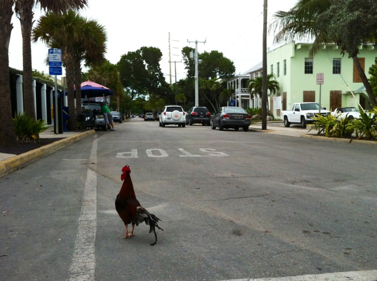
Key West lohnt sich nicht
Key West ist voller Touristen, Zigarrenläden, Margerita-Bars und T-Shirt-Läden mit den immergleichen Motiven. Die Motive halt, die man im wieder nüchternen Zustand verschämt im Schrank liegen lassen wird. Auch die typisch amerikanische Gastro-Freundlichkeit verflüchtigt sich, wenn das Lokal keine wiederkehrenden Gäste erwartet und seine Tische eh jederzeit mit Touris voll bekommt.
Daumen runter für diese überteuerte Touristenfalle. Aber wenn man schonmal da ist, lohnt es sich, ein Fahrrad zu mieten um das Örtchen abseits der Touristenbusse zu sehen. Denn immerhin gibt’s freilaufendes Federvieh auf den Straßen und Häuserchen im karibischen Stil.
Weltmeister im Nörgeln
Der Deutsche, so heißt es oft, sei der Weltmeister im Nörgeln. Mitgehörte oder persönliche Gespräche während meines Amerikaurlaubes erinnern mich daran, dass auch die Amis nörgeln was das Zeug hält.
Der Dollar geht vor die Hunde, die Regierung ist unfähig, Steuern sind zu hoch, Colleges sind zu teuer, die im Süden sind Rednecks, die im Norden spinnen weil sie sich eine kalte Jahreszeit antun…
puh, auch alles nur Menschen jenseits des Atlantiks 🙂