Keying Window Reflections, Smoke and Explosions
This post is about a keying technique that saved my ass on a couple of difficult shots recently.
Most keyers are all about pulling a matte from a green or blue screen plate which is then used to merge a despilled image onto the desired background. This technique has its limitations though and who doesn’t know the tedious task of combining and layering several keyers in different parts of an image until the result looks right.
There are, however, keying issues that are hard to get right even by combining multiple keyers: things like glass or glow. Both phenomena are additive in nature – they add light on top of what’s reflected from the green screen into the camera lens – which makes them different from semi-transparent things like smoke or motion blur. In compositing terms this means that there is no proper alpha value for them but since they change the color of the green screen behind them (reflections on a glass window are a good example) traditional keying algorithms will calculate an alpha value > 0 anyways.
The technique I’d like to demonstrate is simple. I didn’t invent it, by the way. I first came across it in a post from the Shake mailing list years ago but didn’t fully understand it. A compositing artist on “Vanilla Sky” (if I remember correctly) said that he pulled a soft matte and used it to push the color-corrected background through the foreground, preserving grain and fine hair.
These are the steps you need to take:
- Use a color difference formula to pull a soft matte, which is similar to despilling: use the difference between green and the average of blue and red, or the difference between green and the maximum of blue and red.
- Instead of manipulating that matte until it’s fully black and white, use it as it is to add the background image onto the (despilled) foreground image. This will lead to a strange low-contrast mix of foreground an background. But here’s the trick:
- Crank up the contrast of the background image until the result looks right. This of course only works in floating point since it requires pixel values outside the 0..1 range.
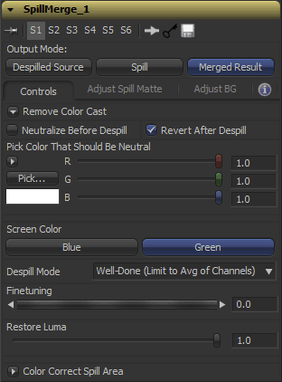 This technique will preserve edges perfectly as well as glow, reflections or smoke up to a degree where the greenscreen is but a tiny green tint in the background. On the other hand, it will also “imprint” any imperfections of your green screen into the result: folds, shadows, tracking markers, uneven lighting. This means that you either need to do some serious cleanup work and degraining beforehand or combine this technique with traditional keyers (e.g. just for fine hair, or inside a window pane).
I’ve turned all of this into a handy Fusion macro. For Nuke, you can use the “Despill” gizmo from Luma Pictures, which served as an inspiration for the UI of my macro.
I’ve called the tool “SpillMerge” since it performs a despill first, then merges a background image into the despilled area (it basically treats the screen as a giant spill-affected area instead of trying to pull a solid black/white matte).
Download SpillMerge here or read the manual at vfxpedia.com.
Cloud Atlas For The Win!
I’ve recently watched Cloud Atlas. Man, that movie makes up for all the shitty blockbusters I’ve endured this year.
You know that phrase that is usually attached to novels adapted for the big screen?
“Yeah, the movie’s OK but the novel of course goes deeper, they had to leave out lots of stuff for the adaptation”.
Well, without having read the novel, “Cloud Atlas” felt to me like what an adaptation of a plot which spans centuries needs to look like but almost never can. And it’s rich enough to watch it a second time to take note of the finer details and motives of each character. On the other hand, the movie’s central theme isn’t hidden or complicated at all so there’s no “why… what the f…?” feeling like in Prometheus.
I’m aware that any movie-going experience is highly subjective. So I’m just glad that the movie totally worked for me in keeping me entertained, emotionally involved and impressed by its ideas. In my opinion, “Cloud Atlas” demonstrates what the movie medium can achieve in storytelling and editing when most blockbusters are just pushing the envelope in VFX photorealism. Nevertheless, “Cloud Atlas” is chock full of VFX.
A bunch of German VFX houses have worked on it, including RiseFX (Berlin) as well as Trixter and Scanline (Munich). Although I’m sure none of them could have shouldered the amount of shots that the main vendor (Method) did, I think it shows that there’s a great amount of talent on the old continent 🙂
10/10 (the “this is one of those few movies I’ll never forget” level)
Freeze Camera Script for Fusion
I’ve seen this in a Nuke pipeline recently, so I thought I’d rewrite it for Fusion: a script that copies an animated camera and freezes it at the current frame so you can use it for camera projections. Much faster than clicking “Remove Animation” on half a dozen controls 🙂
Download Freeze Cam.py (goes into Scripts:\Tool folder)
If you have customized your context menus, add this snippet to your Fusion.menus so you can access this script quickly when right-clicking a Camera3D tool:
Camera3D = {
   { "Freeze Projection", [[@Scripts:Tool\Freeze Cam.py]] },
},
Also goes along well with my other script, which quickly aligns cards in 3D space if you have a point cloud: 3-Point-Imageplane (includes screencast)
15 Minutes of Fame
I’ve been interviewed twice in recent weeks.
Eyeon Software asked me about development aspects of Fusion (scripting, fuses, macros) and Digital Media World allowed me to give some insights into my career path as a VFX artist. I’ve also talked a bit about the soft skills that in my opinion make life easier on VFX jobs: tolerating frustration and being able to communicate well between teams (e.g. editorial and VFX)
Tool Color Labels for Fusion
So… Fusion doesn’t colorize its nodes as extensively as Nuke does. It only has basic color cues for loaders, savers, masks, particles, 3D. That’s all good but maybe you get bored or confused with the 2D part of your comp which is mostly gray. There is a tool colorization script that ships with Fusion, but it’s just a color picker.
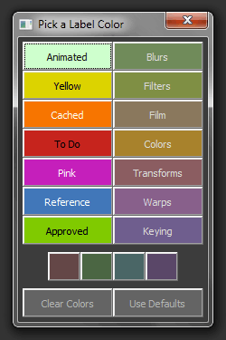 Even before Nuke was widely available on the market, I had written a script to tag nodes with a small set of pre-defined labels – inspired by Mac OS. It was one of my first Fusion scripts and my first shot at IUP for user interfaces as well and I’ve just given it a larger update.
A while ago, Gregory Chalenko (aka Gringo) has published some tool defaults on vfxpedia. Besides modifying the default values of a slider here and there, they also define colors for tools based on their function in a way that reminds one of Nuke. Blurs, transform tools, warps, color corrections… the whole color scheme is nicely desaturated and doesn’t distract your eyes. My ToolColorLabels script on the other hand always had bright highlight colors that were meant to make important nodes stand out.
Version 2.0 of ToolColorLabels not only has some predefined colors taken from Gringo’s color scheme. It also has a new button that colorizes nodes based on what is defined in their default setting files. This is useful if you open a comp that hasn’t been created with your default color scheme or you recently made changes or additions to the files in your Defaults: directory.
The small buttons at the bottom only act on Underlay tools so you can colorize them without affecting regular tools (that are selected along the Underlay once you click it). Take a look at the top of the script, you can customize the colors there as well as disable the second column of swatches in case you want to have less buttons.
Death to Lens Flares
I used to like lens flares. But after watching the 2012 remake of “Total Recall” (the boring CGI extravaganza starring some dude and Kate Whats-her-name) I just can’t stand them anymore. This movie is really shoving the OpticalFlares plugin into your face. It’s like an obnoxious mosquito in your room. STOP IT and get on with the plot already!
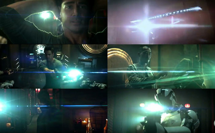
Oh. Right. Plot. That movie really has nothing else to offer but CG set extensions and optical flares.
Wait… what puts me into a position to criticize a movie that clearly has an audience? Me, who hasn’t even gone through script-writing classes? Well, as somebody who eats food I have a right to criticize a dish I didn’t like based on the fact that I’ve enjoyed a similar one in the past. I don’t have to be a cook myself 🙂 And since the internet is already full of movie criticism that nobody wants to read, I’m trying to blend some thoughts on look and VFX into my ramblings. So here we go.
If you freeze a single frame you can really see the hard work put in there by the VFX crew. I didn’t work on it but if it’s anything like the Hollywood shows I’ve worked on, it usually goes on and on like this for weeks:
Put some more sparks here, add a tiny glint over there.
Fix edge of hair on screen left.
Add more teeny-tiny holograms in the background that nobody’s gonna notice unless they print out single frames from the Blue-Ray and stare at them for a minute…
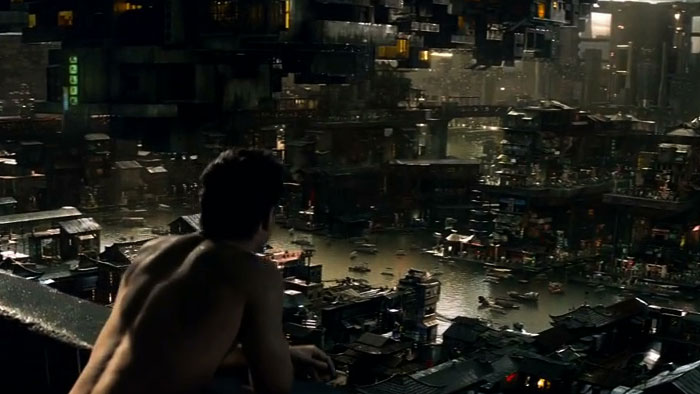
Awesome level of detail in Total Recall’s CGI set extensions (crop from HD trailer)
I can only image how many revisions the compositing artist made to the brightness of the roof to the left of Colin Farrell’s head until VFX supervisor and director were happy. 3? 5? But what good does this level of detail and photorealism do if somebody should have put more effort into script and characters instead?
I know, it’s a science-fiction movie. And the whole movie might be a dream anyways. But things like the elevator through the earth’s core or the floating buildings in the sky kept bothering me.
Questioning this kind of stuff isn’t really about questioning the thoughts that were put into a movie universe and its back story. Maybe it’s hinting at the fact that many look and set design decisions are an iterative process done in VFX postproduction (“hey, let’s put even more buildings into the background and make it look like they’re floating in the sky!”). There is one scene in Total Recall that shows how well it can work out when design decisions are rooted in the script instead: Quaid saves his life by disabling a robot soldier at lightning speed. He is able to loose two screws and rip out a circuit board in two seconds because he performed the reverse action for years while working at the robot assembly line.
But that’s not the point. Questioning sci-fi technology is more of a sign that what happens on screen just didn’t keep you engaged so your mind starts wandering. There are a lot of movie universes that I enjoy although their technology makes no sense if I start thinking about it for even a minute. The original “Total Recall” by director Paul Verhoeven is equally far out, but I can’t help but feel that Arnie’s Quaid/Hauser character was actually torn between what is true and what is just mindgames.
In 2012, Hauser/Quaid is just an underwear model being chased by a lingerie model through set pieces copied from other movies like “I, Robot” or “Minority Report”. Toned down for a PG-13 rating and the largest possible audience.
Just fire up an image search for “total recall” and compare the screenshots. Verhoeven’s version has left us with so many iconic images that still ring a bell 22 years later! Which of the top row of images will you recall in 2034?
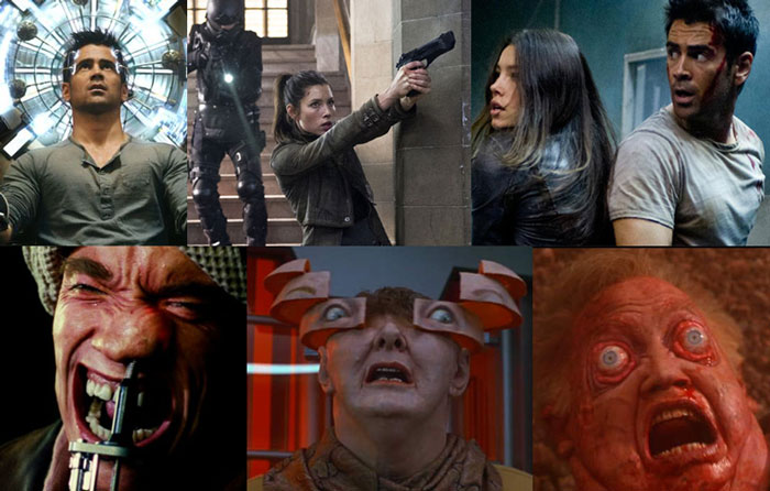
In 1990 they weren’t afraid of saturated colors yet. 2012 is – of course – orange & teal.
To sum it up, “Total Recall (2012)” is boring stuff for guys like Mr Egan from the UK who shares this nugget in an IMDB review:
PS. How can a movie not have a 10/10 when it includes a woman with not Two but THREE whole breasts?
On my scale: 5/10 (the “mediocre waste of time but not horrible” level)
Trashy Rausgepustet
Hat mir neulich ein Kollege gezeigt:
Großartiges Buzzword-Bingo aus der VFX-Branche 🙂
